
SCOPE
45 neighbourhoods · 9 villages · 9 synthetic personas · 3 modules
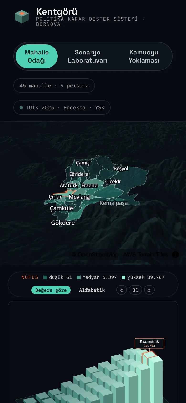
Neighbourhood Focus shows the demo district (Bornova) as a 3D terrain map with an isometric bar chart beside it. When a layer is selected (population, income per person, household income, household size, marriage rate, education, share of women, business density, pharmacy access, socio-economic group, 2023 and 2024 election results) the map and the bars are recoloured together, and the ranking list reorders itself with the same data.
When a decision-maker clicks a neighbourhood, the map, the bar chart and the neighbourhood profile on the right update together. Which neighbourhood sits at which value reads at a glance, without searching.
For the selected neighbourhood, the right panel shows where it stands in the chosen layer (rank, difference from the district median, position between the lowest and highest values), then the gender split, income and household indicators, the education and marital-status distribution, and access to services such as pharmacies.
Below the panel sit a short synthesis specific to the neighbourhood and a "Run a scenario for this neighbourhood" button; the same neighbourhood context carries straight into the Scenario Lab.
Neighbourhood data is read as nine synthetic personas formed by the intersection of income group (A-B, C1-C2, D-E) and demographic (young person, adult woman, adult man): Defne, Selin, Murat, Emre, Ayşe, Hasan, Elif, Fatma and Mehmet. Each persona's estimated population share in the selected neighbourhood is shown alongside.
Opening a persona reveals the profile (identity, description, media habits, decision criteria, a seven-trait personality scale), a knowledge bank and a one-to-one chat. Replies come with an inner voice, a positive/undecided/negative tag, an interest level and a theme; replies can optionally be given in the context of the selected neighbourhood.
A strategy, service, activity or communication strategy is written; the scope (the whole municipality, villages, or a single neighbourhood) and the citizen profiles are chosen. The system proposes 100 questions across ten themes (cost and fees, transport and access, hours and timing, digital channel, trust and transparency, participation and voice, care and family, safety, content and benefit, public space).
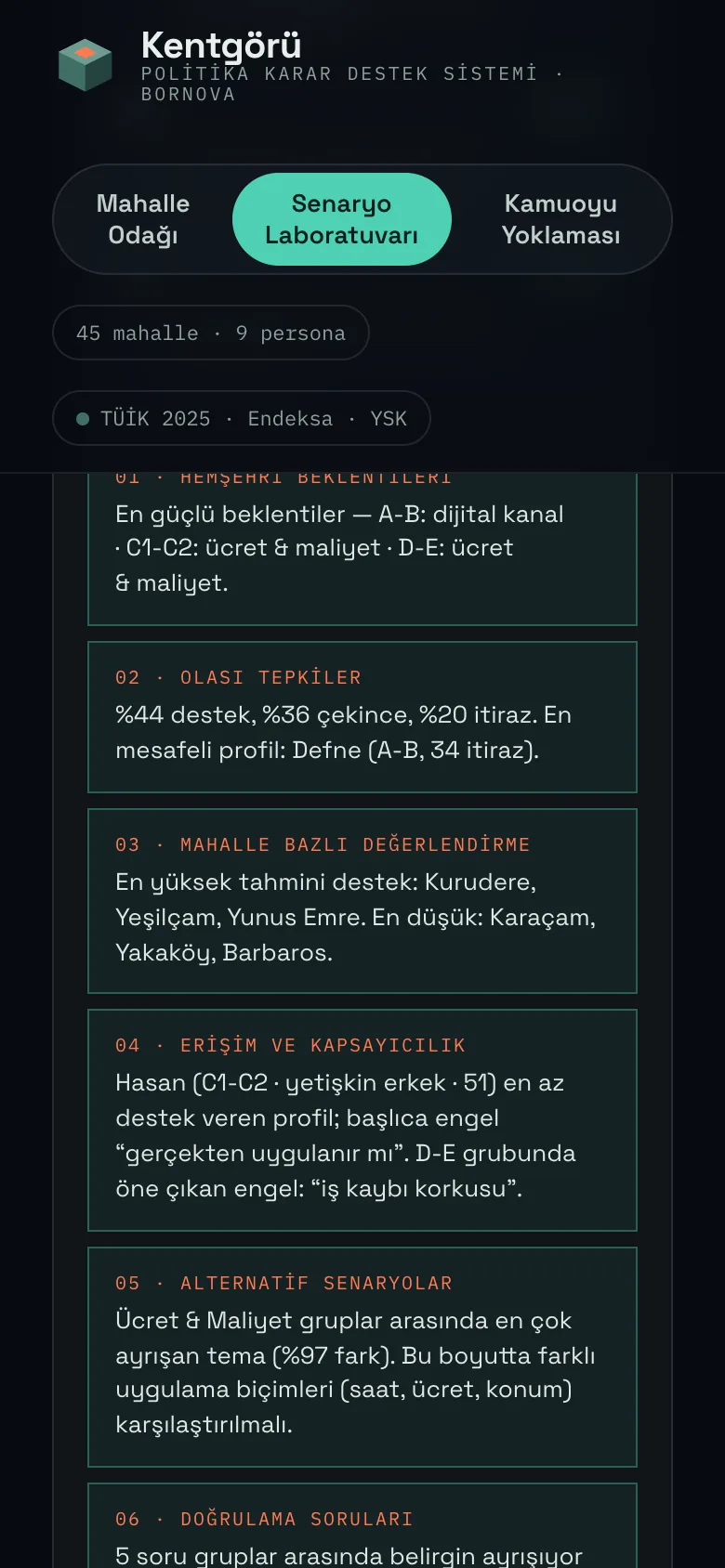
The user approves, removes or adds questions. The approved questions are put to the nine personas; the answers are gathered into six output cards (expectations, likely reactions, neighbourhood-level assessment, access and inclusion, alternative scenarios, validation questions), a reaction matrix and a synthesis text. The result can be sent to the map, neighbourhood by neighbourhood.
The user gives a topic (for example "24-hour libraries in every neighbourhood"); the system proposes three survey drafts to suit it: a short pulse (5 questions), a detailed survey (10 questions) and an options comparison (6 questions). Questions are edited, reordered and approved; then the audience (the whole district, villages, or one neighbourhood), an income filter and the sample size are chosen.
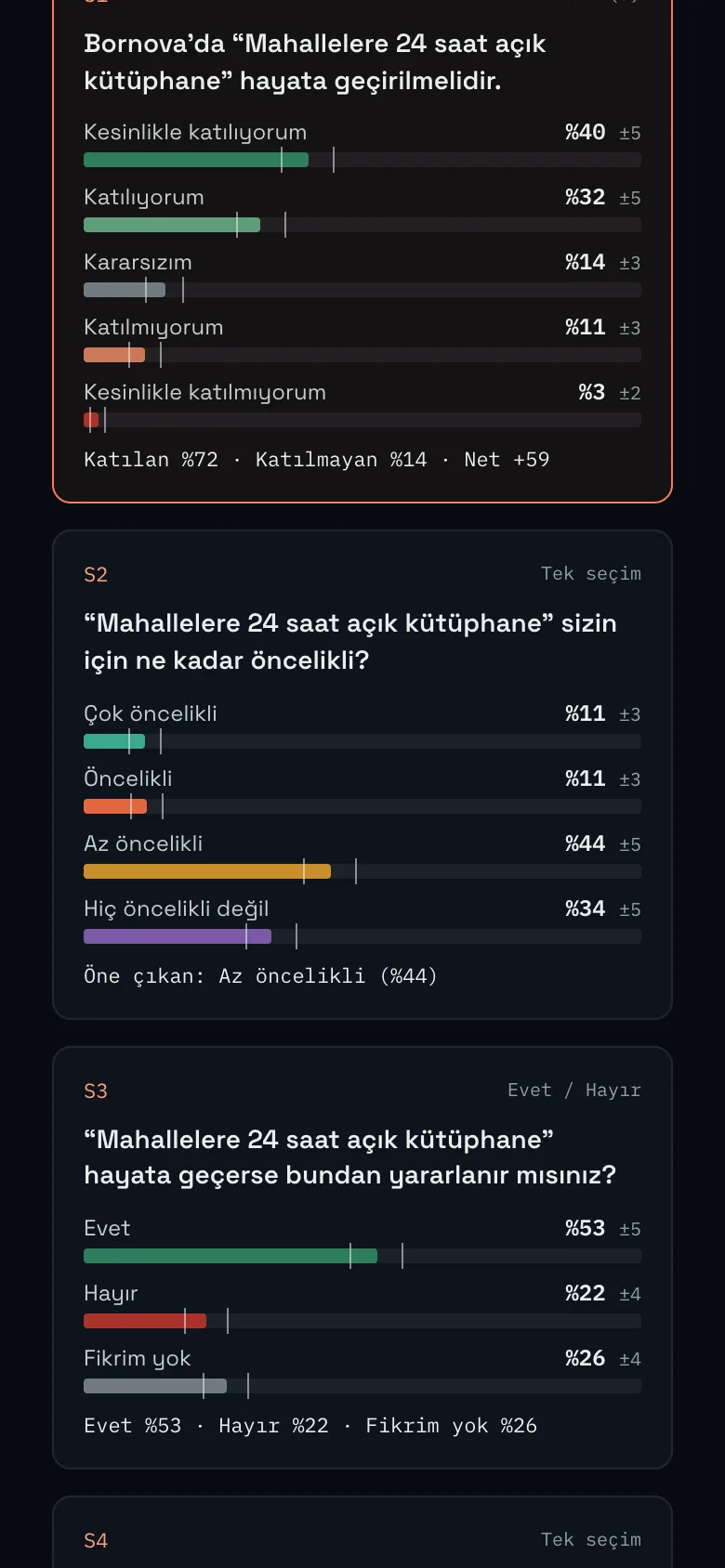
The results screen gives each question's distribution with its margin of error, a breakdown table (income group, age, gender, education, urban/rural, 2024 vote, neighbourhood) and a CSV export. Every result is clearly marked "SYNTHETIC" on screen.
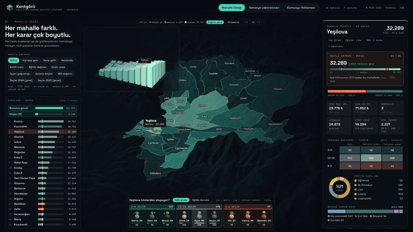
The 3D terrain map, rotating bar chart, layer chips and the selected neighbourhood's profile on one screen.
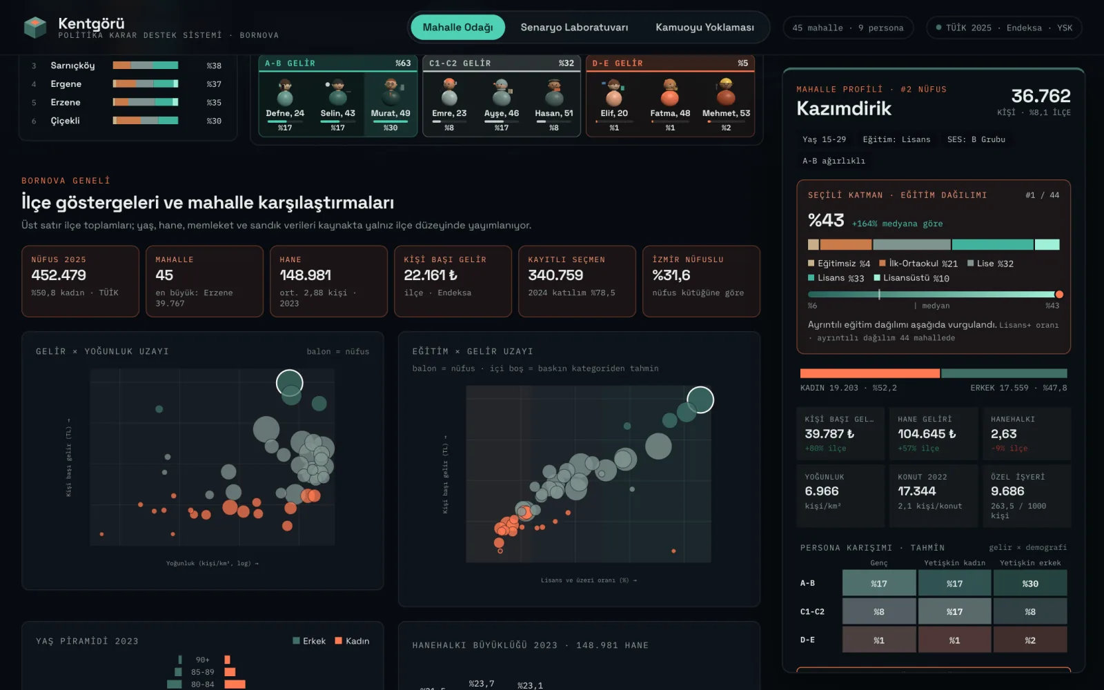
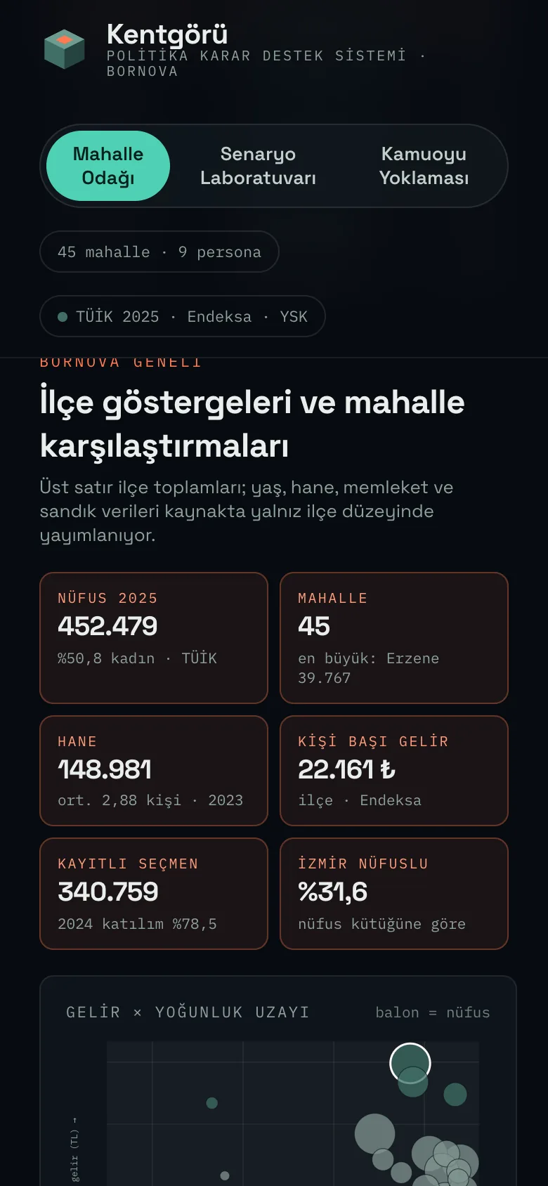
District indicators and neighbourhood comparisons: income against density, education against income.
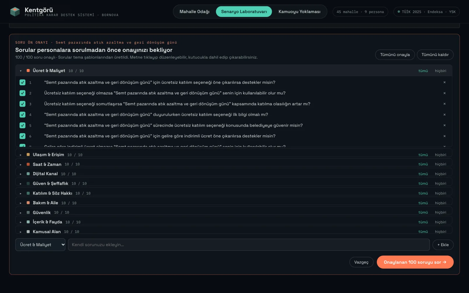
The 100 proposed questions are grouped into ten themes; each one is approved, removed or supplemented individually.
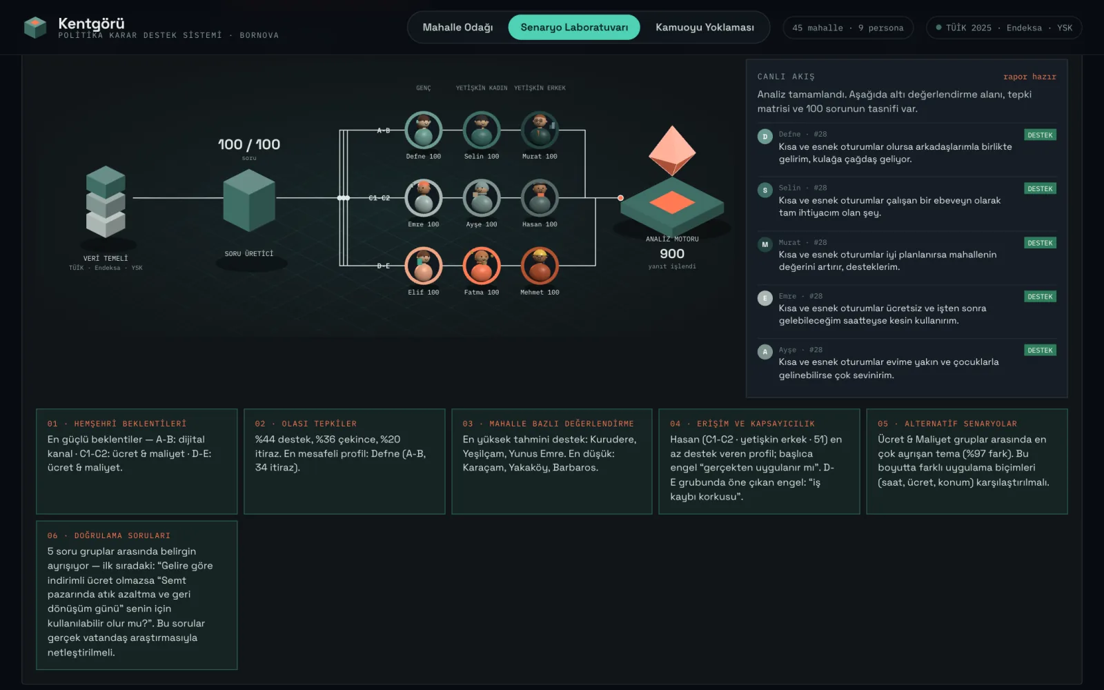
The process from data base to question generator, nine personas and analysis engine is followed live.
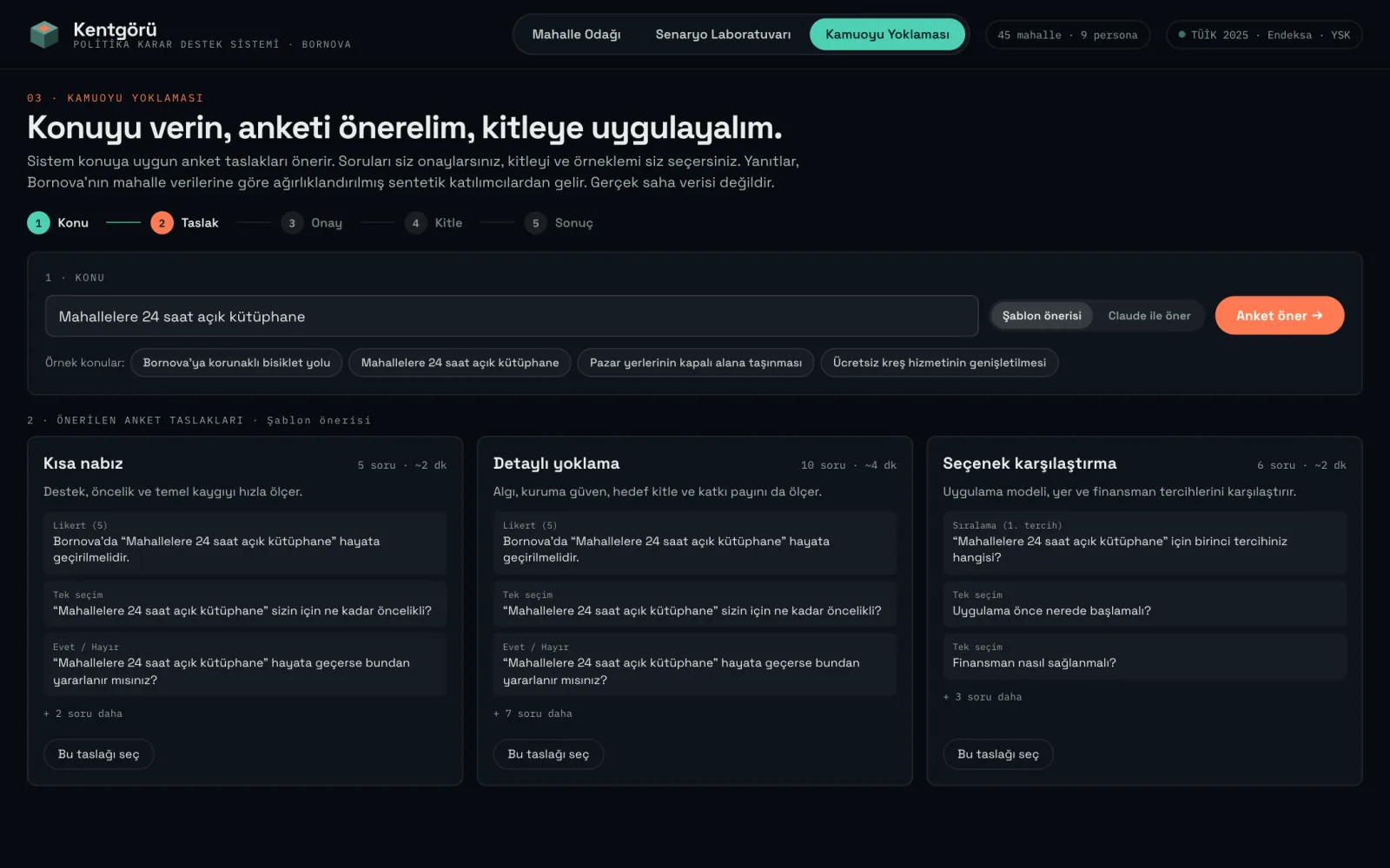
Three drafts for the topic: short pulse, detailed survey and options comparison.
At 390 px the interface collapses to a single column: the map, layers, scenario and survey results work the same way on a phone.
The personas and survey respondents in Kentgörü are synthetic profiles weighted by the neighbourhood data of the demo district, Bornova (TÜİK 2025, Endeksa, YSK). The outputs are not real citizen opinion or field data; they exist to show which questions should be put to which groups when a new policy is considered.
That is why results are marked "SYNTHETIC" on screen and why, on every run, the system generates validation questions that a real study should settle. Kentgörü is a design prototype; moving it to a production architecture is a separate decision.